
Charger analysis
Find the chargers that need attention on the Chargers tab, and read one charger's own page: lifetime totals, plug timeline, utilization, charge success, uptime, firmware, issues, meter readings per phase and an AI analysis of a window you choose.
Every charger has its own analysis page: what it has earned so far and how it behaved in recent weeks. Open it from the Chargers tab of Intelligence to see what is going on with one charger.
At a glance
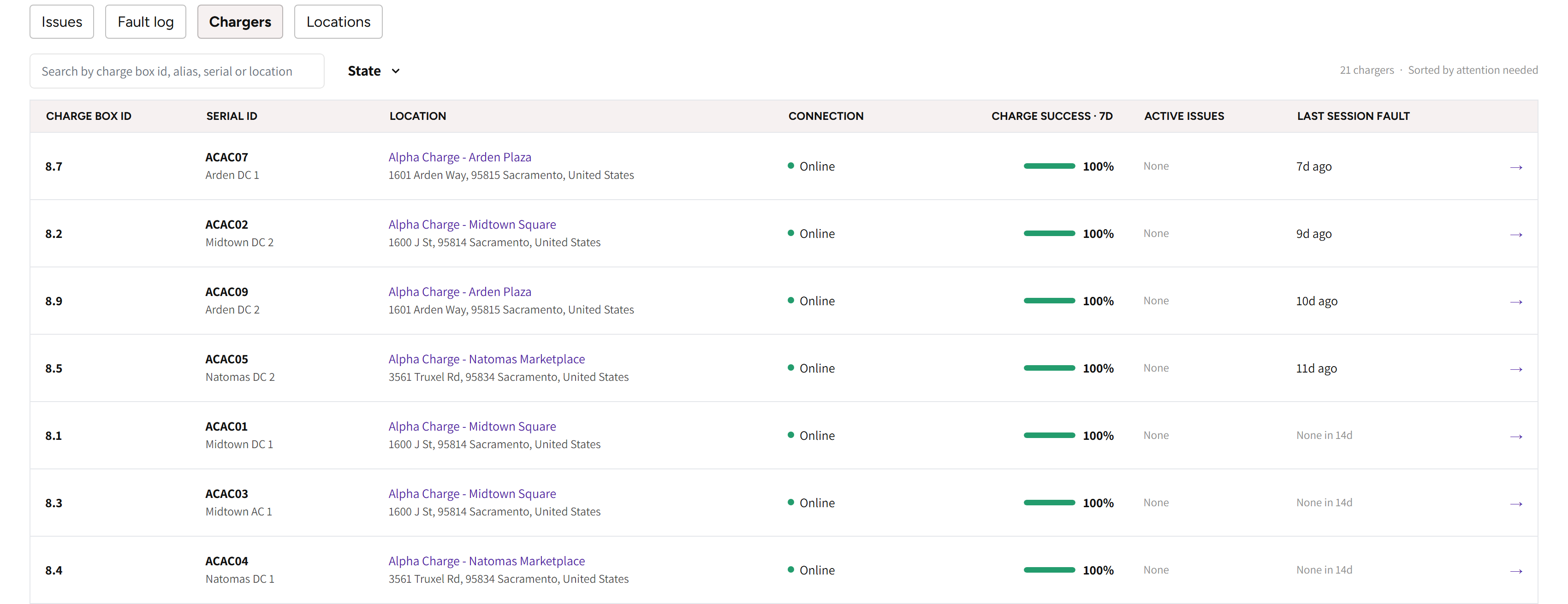
- Chargers: the tab with every charger, Sorted by attention needed, so the chargers to look at come first.
- The search box and State: find a charger, or show only the ones in one state.
- Charge box ID, Serial ID and Location: which charger it is and where it stands.
- Connection, Charge success · 7d, Active issues and Last session fault: how each charger is doing lately.
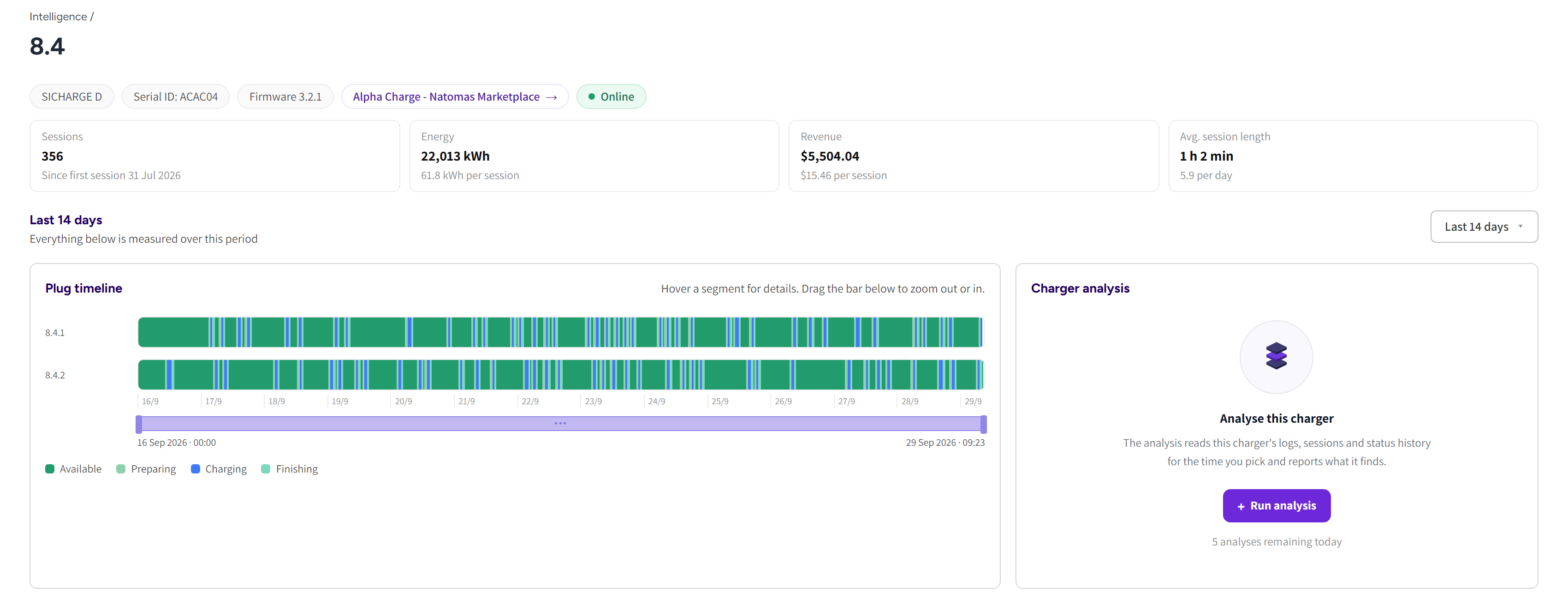
- The title is the charger's charge box ID. Under it: the model, Serial ID, the firmware, the site as a link and whether the charger is online.
- Sessions, Energy, Revenue and Avg. session length: the charger's whole life, not the selected period.
- The period picker: Last 14 days, Last 30 days or Last 90 days for every card below it.
- Plug timeline: what each plug was doing across the period.
- Charger analysis: start an AI analysis of a window you choose.

- Utilization: the hours in use per day, against all hours in the day.
- Charge success: the share of started sessions that delivered energy, day by day.
Find a charger on the Chargers tab
- Open Intelligence and pick the Chargers tab.
- Search by charge box ID, alias, serial or location, or pick a State: All, Offline, Faulted or Unstable connection.
- Click a row to open the charger's page.
| Column | What it tells you |
|---|---|
| Charge box ID | The charge box ID the charger connects under. |
| Serial ID | The charger's serial, with its alias under it. |
| Location | The site, which opens its location analysis. A home charger reads Home charger, and its page works the same way. |
| Connection | Online or Offline right now. |
| Charge success · 7d | The share of started sessions over the last week that delivered energy: green from 90%, amber from 75%, red below. It reads No data when no session started that week. |
| Active issues | The open issues, with the critical ones called out. |
| Last session fault | How long ago the last fault was, or None in 14d. |
The chargers with the most open issues come first, then those with a recent session fault, then low charge success. It does not follow the period picker above it. A count in the Needs attention strip opens this tab with the matching State already picked.
Read the charger's page
The lifetime tiles answer whether a charger has earned its place.
Sessions shows the first session's date, and Energy and Revenue show the figure per session. Avg. session length shows the sessions per day. If the charger reports meter readings, then a fifth tile, Avg. charging speed, shows its average power while a car is charging.
| Card | What it shows |
|---|---|
| Plug timeline | Each plug's status across the period. Offline periods are drawn over the plugs, and the window of the last analysis is marked. Hover a segment for its details, and drag the bar under it to zoom. |
| Utilization | Hours with a session running, against all hours in the day. |
| Charge success | The share of started sessions that delivered energy, day by day. Hollow dots mark days with one or two sessions. |
| Uptime | The share of the period the charger was connected. Short connection drops count here even when no charge was affected. |
| Firmware history | Which firmware the charger ran and when it changed. It lists only the updates run from your dashboard. |
| Issues on this charger | The open and resolved issues, each linking to its detail. |
| Session faults in this period | The faults of the period, counted by type. |
If a charger has open issues, then the header shows Issues detected next to Online or Offline. A card without data says so, for example No usage recorded for this charger.
Read the meter readings
Meter readings at the bottom of the page shows what the charger's own meter reported over the period.
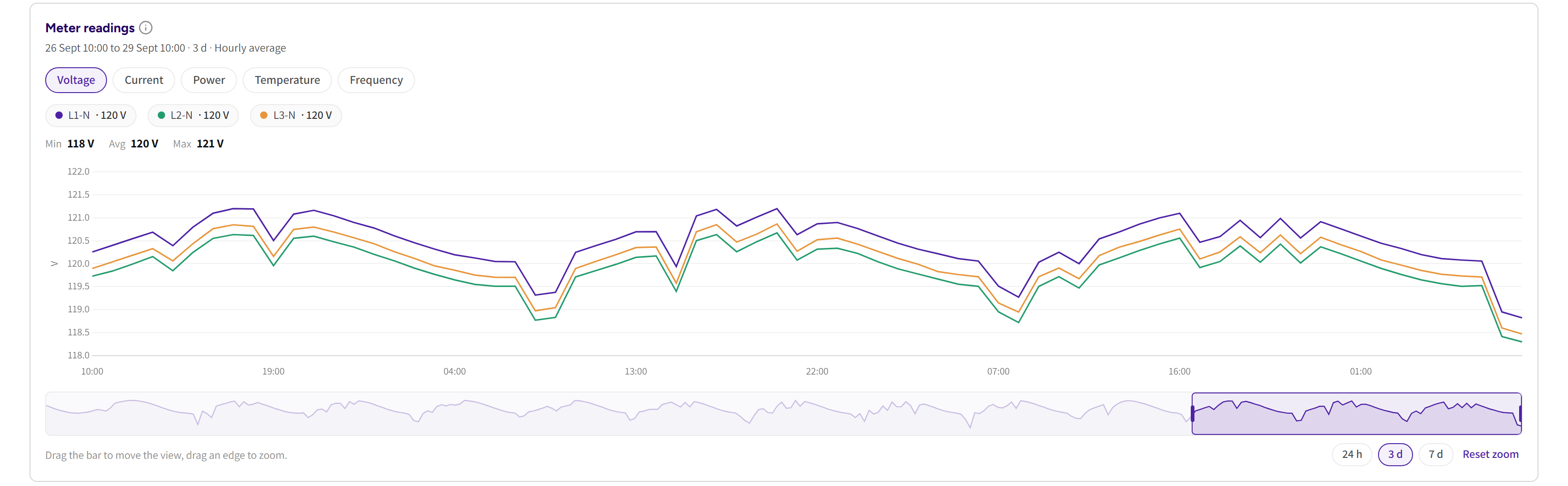
- The tabs Voltage, Current, Power, Temperature, Frequency, Power factor and Fan speed show only the readings this charger reports.
- If the charger reports a reading per phase, then each phase gets its own line; otherwise each plug gets one.
- The chips above the chart hide or show a line and give its average for the visible part.
- Min, Avg and Max are for the visible part too.
- The zoom bar under the chart moves and resizes the visible part.
- 24 h, 3 d, 7 d and 14 d jump to the last part of the period.
- Over 30 or 90 days there is no 24 h.
- Reset zoom shows the whole period again.
Over 14 days each point is an hourly average, and over 30 or 90 days a daily average. These are the meter's raw values: nothing here is billed or corrected.
TipIf one phase of a three phase charger sits well below the others on Current or Voltage, then check the wiring and supply first. It often shows before a fault does.
Run an analysis of a window
The Charger analysis card reads the charger's logs, sessions and status history for a window you pick. Use it when a driver reports a problem that no fault explains.
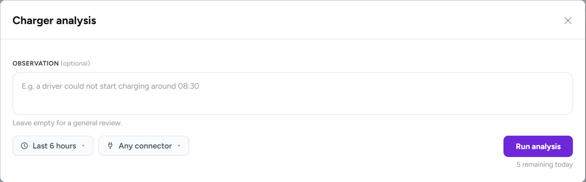
- Click Run analysis on the Charger analysis card.
- Describe what happened under Observation, or leave it empty for a general review.
- Pick a window of at most 24 hours, or one Suggested from this charger's data.
- Pick a connector, or Any connector.
- Click Run analysis at the bottom of the dialog.
The analysis runs in the background, usually for one to three minutes, and the report opens when it is done. Your team shares a daily allowance, shown as the analyses remaining today, which resets at midnight. If an analysis fails, then the card offers Try again, and the failed run does not count against the allowance.
| Result | What it means |
|---|---|
| Problem detected | Something in the logs explains the trouble. |
| Nothing abnormal found | The window was read and it was clean, which often rules the charger out. |
| Inconclusive | The window held too little to say either way; a wider window usually helps. |
The report starts with Window examined, Scope, Evidence read and Result. Then come an Assessment, Key observations, What happened, Technical details and a Bottom line. Suggested checks open under it.
Under the report, Ask a follow-up puts a question to the Support assistant with the report in hand. Open in the support chat moves that conversation to the chat in your dashboard. See AI support assistant.
Common questions
Why is this charger at the top of the list? The tab puts the chargers with the most open issues first. Then come the ones with the most recent session fault, then the lowest charge success over the last week.
Uptime is below 100% but nobody complained. Is something wrong? Short connection drops count against uptime even when no charge was affected. If the plug timeline shows only minutes of gaps and no failed sessions, then nothing is wrong.
The analysis found nothing abnormal, but a driver had a problem. What now? Run it again with the exact time the driver gave you, or a wider window of up to 24 hours. The suggested windows come from the charger's own faults and offline periods, and usually hit the right time.
We used all our analyses for today. What can we still see? The allowance is shared by your team and resets at midnight. Every card on the page, the timeline, the faults and the issues need no allowance.
Why is there no Temperature tab on Meter readings? The tabs follow what the charger reports. A charger that never sends a temperature gets no Temperature tab rather than an empty one.
Updated 10 days ago